Visual Language Assignment 1: Design Analysis
September 08, 2020
Hierarchy
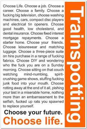
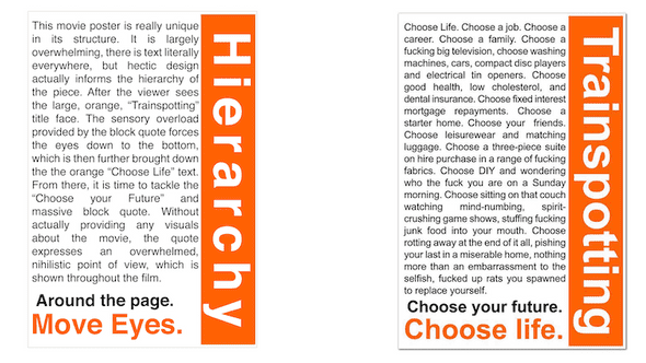
This movie poster is really unique in its structure. It is largely overwhelming, there is text literally everywhere, but the hectic design actually informs the hierarchy of the piece.
After the viewer sees the large, orange, Trainspotting title face. The sensory overload provided by the block quote forces the eyes down to the bottom, which is then further brought down the the orange Choose Life text.
From there, it is time to tackle the Choose your Future and massive block quote.
Without actually providing any visuals about the movie, the quote expresses an overwhelmed, nihilistic point of view, which is shown throughout the film.
Grid System
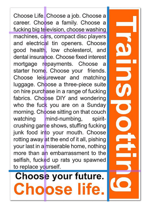
For this poster, I felt that it didn’t particularly follow a classic “rule of thirds,” but had a very distinct grid system. Primarily, it is 3 blocked out grids existing side by side.
I drew dark blue lines to illustrate these three areas: the Trainspotting typeface, the Choose Life block, and the main quote.
This is a particularly organized, yet untraditional design choice for the medium. Again, it doesn’t share much about the actual film’s characters or visual persona, but gives room for the quote to breath as the main source of information.
I also added the purple lines to express some of the intentionality behind the sides and placements of the text. They are just a little less than a third each, if one were to maintain this grid design, they could make a myriad of visually balanced posters. However, in our case, we let this intense quote consume the poster (just as it would consume the characters).
Negative Space
This piece does not use a lot of negative space, if anything I think it uses the lack of negative space to its advantage. The lack of negative space is chaotic.
Typography
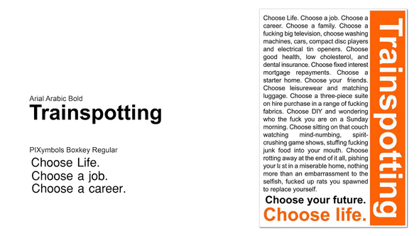
Using “What the Font?” I was able to identify the main Trainspotting typeface to be Arial Arabic Bold. With that matching the text at the bottom of the poster. This font is used for the most obvious/largest parts of the poster. It is always bold and the artist uses different colors to highlight its importance. Not once does it have the same weight as the block quote.
Using the same process, I loosely identified the main paragraph to be PIXymbols Boxkey Regular. I say loosely, because it is small and resembles a few fonts. It could also be a classic Arial or even the same font as “Trainspotting”. That said, it is a small text that is supposed to be easy to read, much like a book. It would be very difficult to assign a unique and different typeface to such a small text. This was done with the thought of readability.
Colors
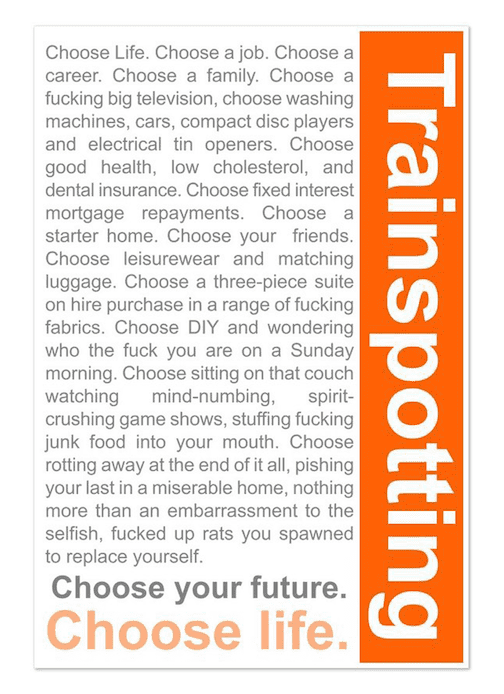
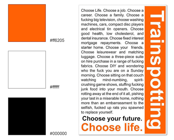
This poster largely uses orange to provide emphasis. Otherwise, it is using black and white to, I think, prioritize readability.
Presentation
Presentation can be found at this link
Written by Philip Cadoux, current ITP student and Creative Technologist. Follow me on Instagram
