Visual Language Assignment 3: Color Compositions
September 28, 2020
Color Compositions
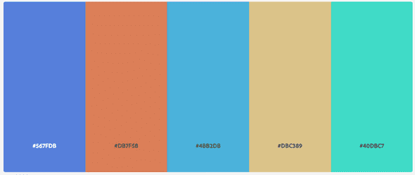
When choosing a color palate for myself, I had no clue what to choose. So, I somehow decided on this palate, which I now look back on with disdain. What the hell is this color palate? I hate it:
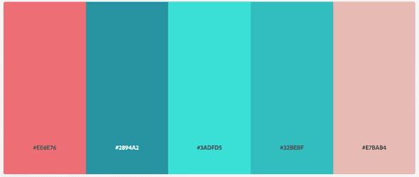
That said, I was exploring the features of Adobe Color and noticed it had a way to confirm that the palate is accessible to the visually impaired. Within that, it showed how someone with Tritanopia would see it. I do not have Tritanopia, but I thought this palate fit me a lot better:
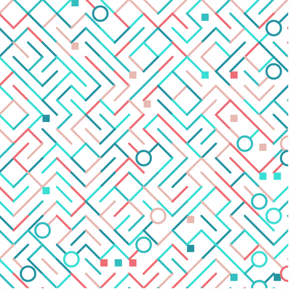
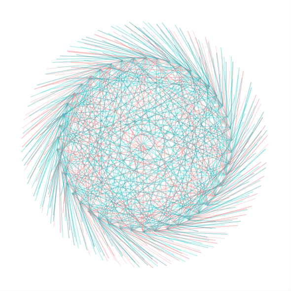
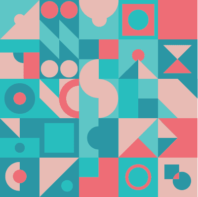
With this in mind, I produced 3 generative art pieces, and 1 in adobe illustrator. I tried to have one composition move, one use randomization, and 1 be grounded in math. Then, for the illustrator piece, I tried to make it pleasing to my own eye. Below are the results
99% Invisible Response
I think the parts of this that made the most impacts on me were the exploration of the sociological parts to color. Specifically, I really liked the story about Mauve. It wasn’t particularly popular, but when a celebrity wore it, everyone was suddenly interested in a color nobody cared about. Furthermore, it wasn’t a color that fashion businesses could just pump out, there were different shades while people figured out the right combo. I also connected with the discussion about Pink. The fact that all pink is, is a light red, but light yellow, light blue, etc don’t have specific names is very interesting. It had me thinking about the Russian (that she spoke about very briefly). In Russian, there is “Goluboy” and “Sinies” that differentiate light and dark blues. Because of this distinction, Russian speakers “see” more blues than english speakers. Its not because they can perceive more blues, but because they can classify them as distinctly different colors.
Written by Philip Cadoux, current ITP student and Creative Technologist. Follow me on Instagram
