Visual Language Assignment 2: Boarding Pass + Expressive Words
September 18, 2020
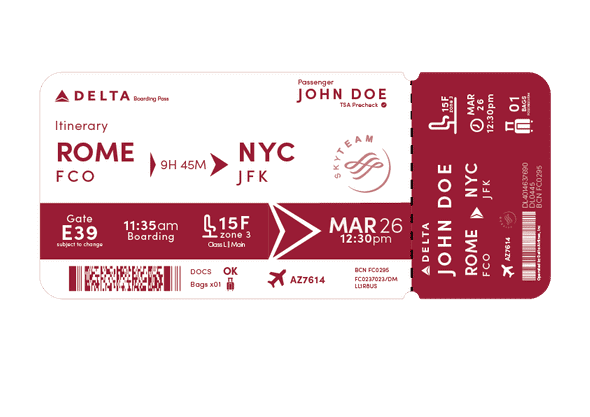
Boarding Pass Redesign
This project utilized graphics from the noun project, here are the credits for the graphics that required them:
- Plane Seat Graphic (slightly edited) created by Aquariid
- Checkmark created by Lars Meiertoberens
Iterations can be found in presentation slides
For this project, I initially started brainstorming things with a lot of white, clean space with the delta logo colors all being reflected (blue, red, maroon). I quickly found them really boring. While its important to be clean and easy to read, a boarding pass feels like a branding opportunity, so taking the space to make something visually different is key.
From here, I designed the stub. I was having issues visualizing the larger part, so I started on the stub. Whenever I am traveling, I always have my boarding pass in my passport with that small stub pointing out. I wanted to make it easy to read from this perspective, so I highlighted the most important parts on the right. I kept in mind the rule of 2 thicknesses down for hierarchy as well.
Next, I started to work on the main piece. I initially tried 3 boxes with different widths to create a clear grid and hierarchy. Unfortunately, the secondary red in the delta logo is extremely bright and I was wrestling with colors for the sake of being able to read, not for design. I also found the whole design crowded. So, I took out the red and completely changed my design. I think it turned out a lot better.
Expressive Words
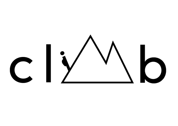
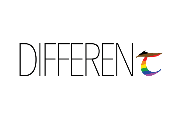
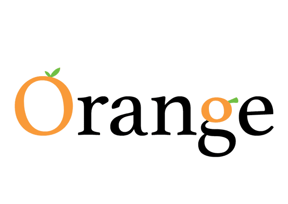
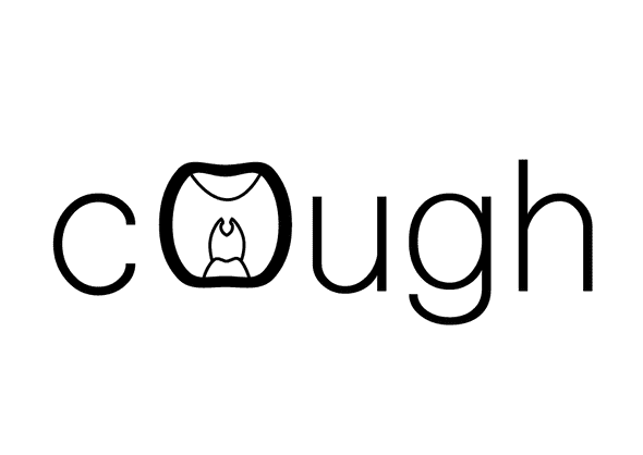
Here are my expressive words. I also made one for cough, but it turns out it was in the video, so I did not submit it. It was also the least conceptually strong.
Written by Philip Cadoux, current ITP student and Creative Technologist. Follow me on Instagram
