Visual Language Assignment 4: Poster
October 07, 2020
Poster Design
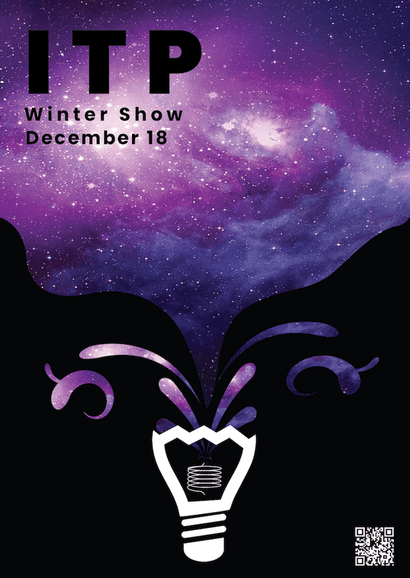
Final Poster
Full res here
Design Process
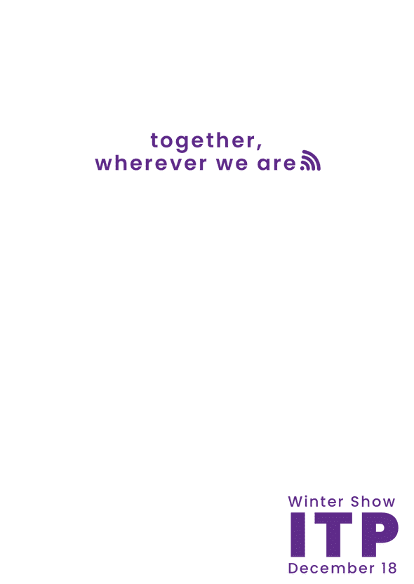
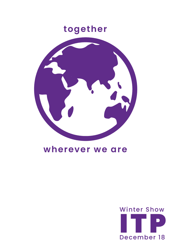
The assignment was to design a poster for the ITP Winter show. I wasn’t exactly sure where to start, but I was starting to gravitate towards something that helped to highlight our connection to one another despite everything. I started to think “we are together, wherever we are.” Which led to these 2 posters:
The issue with these is not inherently their design, they definitely play to my minimalist tendencies. That said, they were very dry and didn’t actually say much about the nature of an ITP show. Is it creative? Is it analytical? If I don’t know what ITP is, then how am I supposed to know what the heck is going on here?
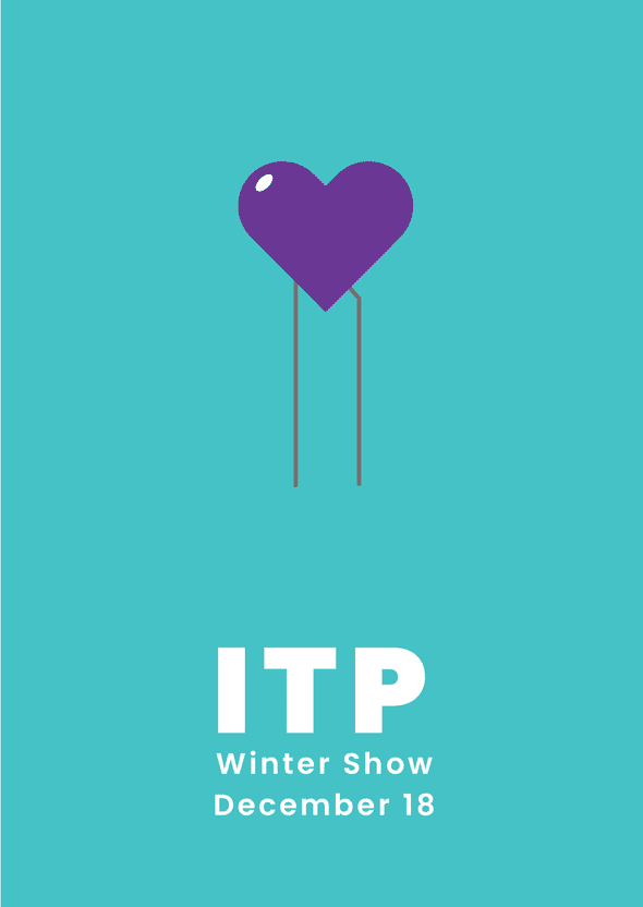
I emailed Katherine and she urged me to think about what ITP means to me. The word “heart” kept coming to mind. This is what I came up with:
This is actually my favorite design of the bunch. I think it’s the prettiest and easiest on the eyes. That said, it still didn’t fulfill the prompt.
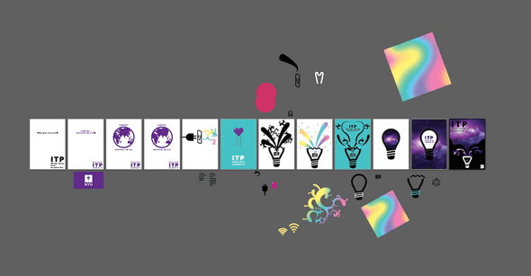
After visiting Katherine in office hours, we started to play around with this idea of limitless potential. After that, I just kept designing. In total, I designed 12 different posters. You can see that here:
Finally, I decided that ITP students were breaking the glass ceiling of what Edison proposed with the lightbulb, offering an infinity of potential. Space is the biggest source of infinity I can think of, so I created a burst of cosmic potential that shattered the lightbulb. I think my artistic skills held me back here and someone with more technical talent could push this to a new stage of perfection. Still, I think being forced to iterate over and over again to find a more sound concept is infinitely more useful than settling on a weak idea with nice execution.
Written by Philip Cadoux, current ITP student and Creative Technologist. Follow me on Instagram
