Visual Language Assignment 5: Logo/Brand Identity
October 12, 2020
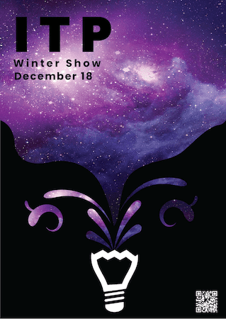
Poster Iteration
I was asked to make the lightbulb a little less busy. I tried a whole new lightbulb design, but it wasn’t as good. I ended up shrinking, moving, and removing the filament of the bulb
Logo and Brand Identity
For this assignment, I started in black and white on a piece of paper.

These are very basic, but they helped me decide I was going to either use my initials PAC or an abbreviation of my last name, CDX. I also am particularly partial to my middle name, so even though I tried it, I really did not want to use PC (it is also my father’s initials).
Quickly, I switched to working in illustrator. I found that I was both faster and more creative working within the confines of my digital art capabilities. I made around 25 different options.
The majority of these are OK, but just did not speak to me. Still, I sent them off to some friend’s who highlighted very common favorites (but shared the sentiment that I hadn’t hit gold yet).
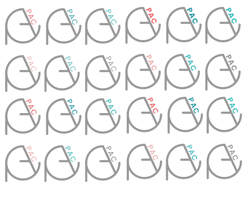
I was most gravitating to the PAC in the middle artboard, but I hated how horizontal and non-iconographic it ended up being. I moved a few of the favorites to the third artboard and realized that there had to be a way to simplify and combine these combinations of curves and stark lines. Eventually, I hit my final piece. Here are the first iterations of that.
Here, I was pretty happy with the first circular design (made some minor edits). But I was playing with the PAC text weights. Eventually I settled on medium.
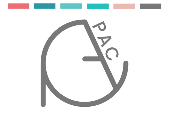
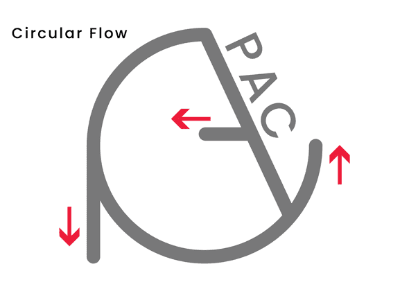
The final logo is below. It uses custom shapes for the symbol and Poppins (medium) for the text.
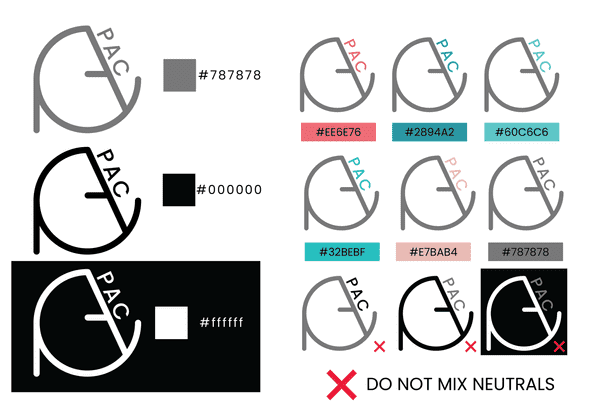
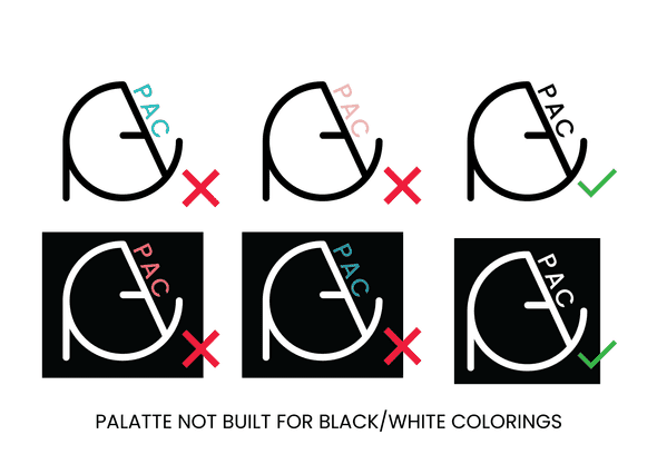
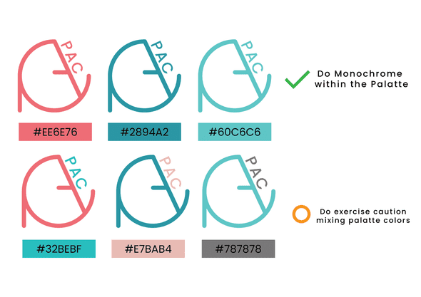
Logo and Brand Guidelines
Written by Philip Cadoux, current ITP student and Creative Technologist. Follow me on Instagram
